
BRANDING
Branding is all about creating identities that resonate and build lasting connections. I love the challenge of shaping how a brand is perceived, from its visual elements to the voice it uses to speak with its audience.

Rally For Sports Equality. This branding project was for my capstone project. I studied the vast inequality barriers between men and women in sports. Through research, I was able to identify the key issues of representation, viewership and opportunities. My campaign wishes to bring attention to and start to change the habits of parents and young athletes. Specifically in what they watch on TV and who they see on social media. Encouraging parents and their children athletes to become more involved in women's sports together. In the branding, I used the flag as that is a predominant symbol of rallies. A well the second "L" in Rally is being supported or held up by the first, symbolizing women being supported in sports.
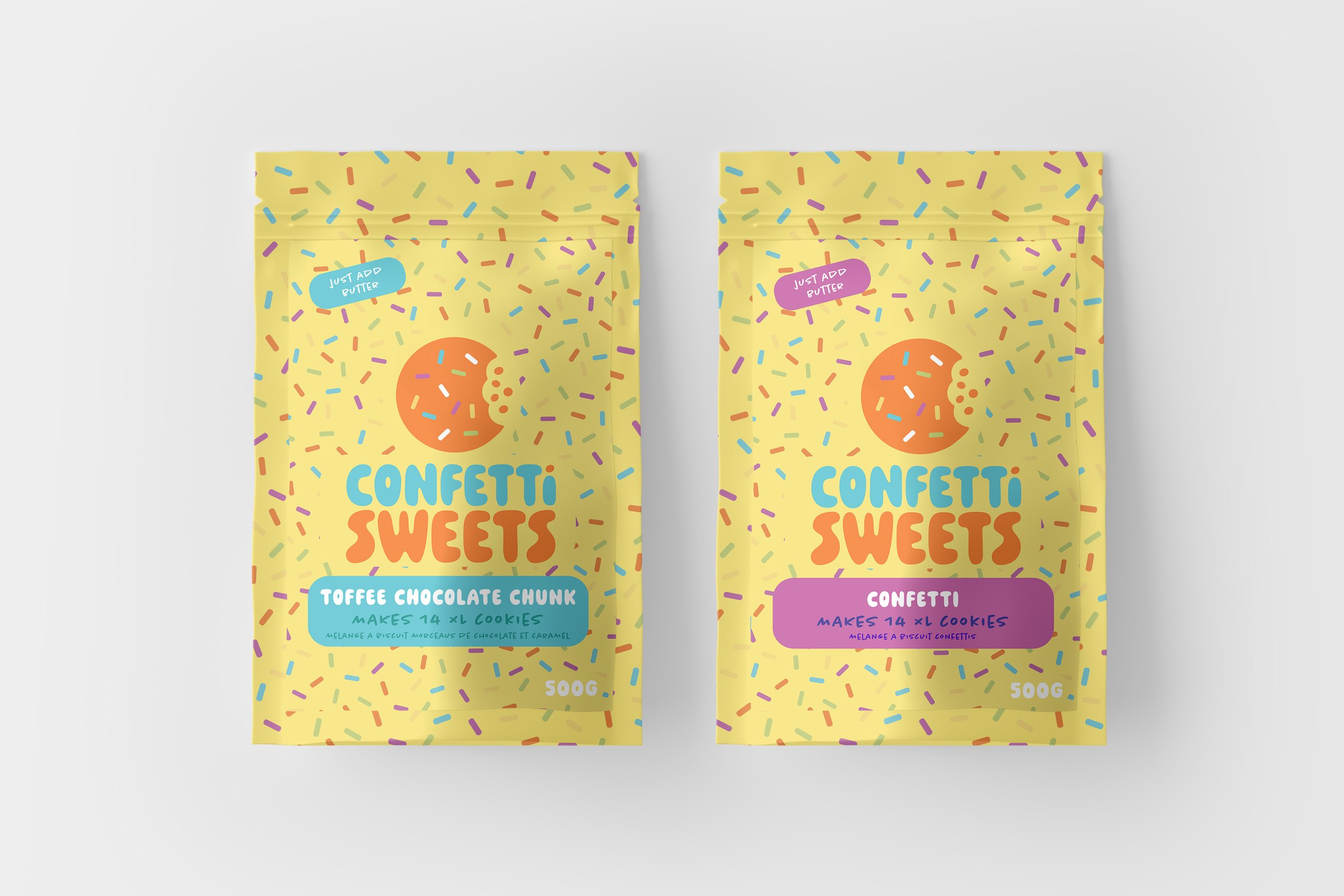
For this corporate ID and branding class, we had to redesign an existing company's identity and collateral. website. Confetti Sweets is cookie company based in Sherwood Park. The colourful palette of neutral sprinkles and macaroons inspires the aesthetic. They are using the colour of the confetti in the logo for the backgrounds. As well as bringing that confetti pattern throughout the designs allows clients and viewers to make visual connections. Connections between the logo and the packaging make for a cohesive whole. Wanted to stretch out from just having a pink aesthetic so the brand could reach a bigger audience.

For this project we were doing a brand lift for the companies visual identity. My take on the redesign for Buffalo Lodge focuses on the main brand inspirations of, relaxation, companionship and connectedness. The blue colours are calming and relaxing, which harps back on our main focus as a group. With that homey feeling that the lodge gives off. The rounded corners help bring out that feeling of friendliness. The connection between the “F” in Buffalo and the “L” in Lodge is indicative of the connection that the lodge has with the different communities in Edmonton. And the communities that the lodge represents. The hooves are a nod to the Buffalo without being an exact replica of a buffalo.
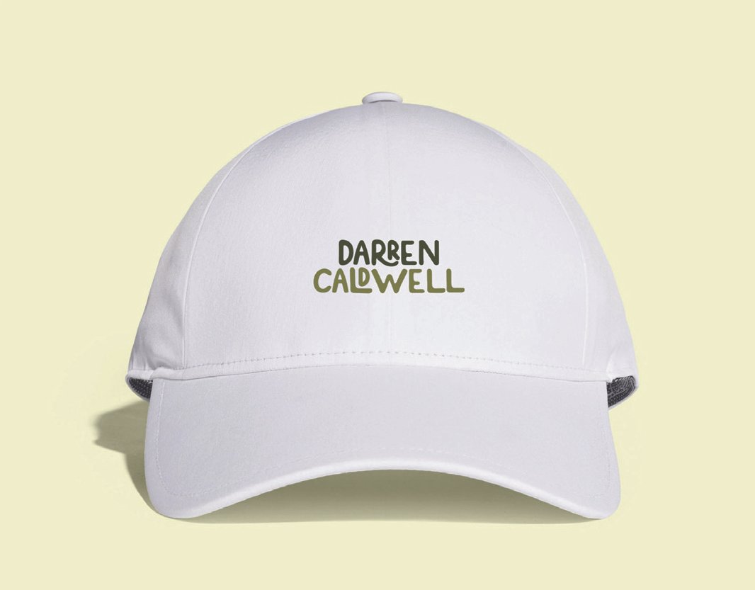
In this project, we had to create a brandmark for an individual that was an accurate representation of who they are as a person. Darren Caldwell was chosen for the brandmark as he is an outdoorsy individual who loves camping and fishing and has a great sense of humour. This font has a structure to it while also being fun and playful—that of a forest-inspired green colour palette. Use the earthy tones to complement the playful font and have it correlate more with nature.

In this advertising project we were tasked at creating a brand or product that would solve a particular problem. Fishing is a vastly male-dominated activity and can be pretty daunting for women. With ANGLHER I want to teach women ages 20-45 years who wish to learn how to fly fish, how to do the skill, and how to be comfortable and confident in performing the activity. This fly tack box would come inside of a branded fly fishing pack that carries a beginner fly case, fly identifiers, fish identifiers, step-by-step instructions (how to cast), and how-to manuals (how to tie on a fly, get a fishing license, and read water). The name is a play on the word Angler who is an individual that fishes. So showcasing the HER in the word stating that females can fish as well. The brand colours were inspired by a Brooke Trout one of the most prevalent fish in Alberta.